Creating a seamless and user-friendly mobile user experience (UX) is crucial for engaging and satisfying mobile website users. Three key mobile UX principles, placement of interaction, the density of interaction, and the size of interaction play a significant role in optimizing mobile UX design.
1. Placement Of Interactions
This is probably one of the most popular principles and yet one that is not applied on most websites.
Interactions related to the navigation such as burgers menu or mains CTA’s are frequently placed in the top corners. This results in hard-to-reach interactions due to the “thumb zone”.
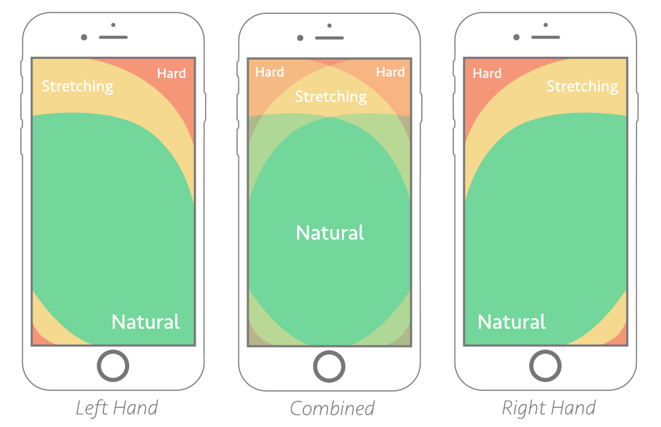
For optimal usability consider implementing a bottom menu instead of the classic hamburger menu. It’s easily accessible at any time, it’s always visible on the screen, and gives information on where the currently active page.
Always prioritize important interactive elements within the bottom half of the screen: Place essential navigation options, primary actions, or frequently used controls in the bottom half of the screen for easy access with the thumb.
2. Density Of Interactions
The density rule of interaction is a crucial mobile UX design principle that focuses on finding the right spacing between interactions.
A good rule of thumb is to include at least 42-72 pixels of space between the interactive elements.
First, the density rule of interaction supports the ease of interaction. When interactive elements are too close together, users may unintentionally tap the wrong option or experience difficulty in accurately selecting their desired actions.
By providing sufficient spacing between interactive elements, you can reduce the risk of accidental taps and enhance the precision of user interactions.
Second, a balanced density of interaction enhances scannability and legibility. When content is crowded together, it becomes harder for users to skim or read the information quickly.
3. Size Of Interactions
The size of interactions is a critical consideration in mobile user experience (UX) design.
Designing with the right size of interactions plays a significant role in enhancing usability and preventing user frustration. Having an unadapted interaction size can lead to missed clicks or an inability to reach desired outcomes.
The recommended minimum size for interactive elements, such as buttons or links, is typically between 7-10mm. Google itself, recommends a minimum of 48×48 dp for interactions.
This size range allows users to tap on the elements comfortably, reducing the likelihood of mis-taps or accidental touches.