Discover UX Form Best Practices for enhancing conversions and user experience. Forms are highly interactive and a key component of conversion, they are often lacking the attention required to optimize them for a seamless User Experience.
1. Keep UX forms simple:
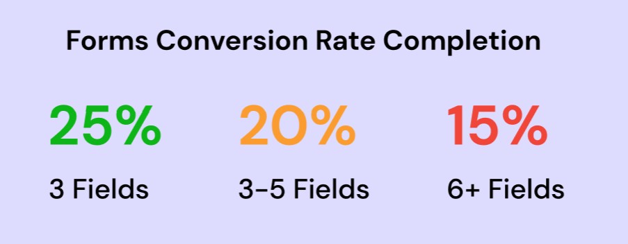
Minimize the number of form fields to only what is necessary. Simplify the form by removing any non-essential fields that are not crucial for the conversion process. Each additional field increases the cognitive load on users and may lead to form abandonment. Fewer forms equal greater conversion rate according to Quicksprout research.
2. Use clear and concise labels:
Provide descriptive labels for each form field to guide users. Clear labels help users understand what information is expected in each field. Use language that is easy to understand and aligns with users’ mental models. Avoid using jargon or technical terms that may confuse users.

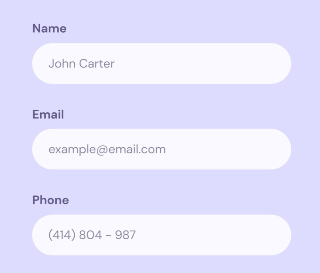
3. Utilize smart defaults and placeholders:
Pre-fill form fields with defaults or placeholders where appropriate. Smart defaults or placeholders can simplify the form-filling process by providing suggestions or examples of the expected format or content. This helps users understand the required input and saves them time by reducing the need for manual input.

4. Employ progressive disclosure:
Break longer forms into smaller, manageable sections or steps. Long forms can be overwhelming and discourage users from completing them.
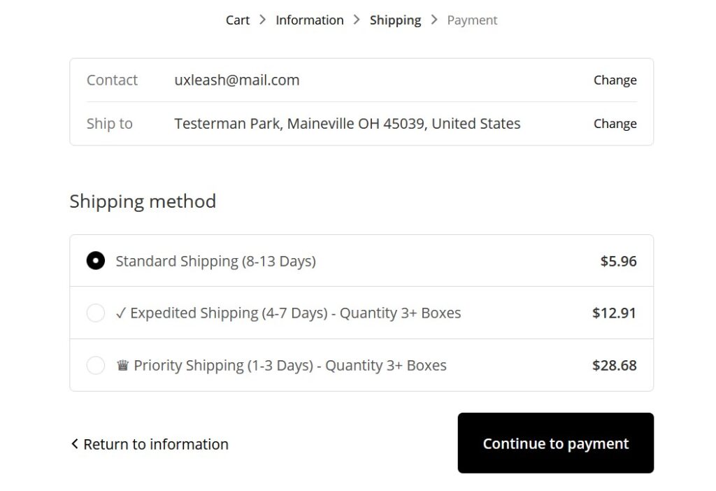
4. Indicate progress if multiple steps are involved:
Implement a clear progress indicator to inform users about their current position within the form and how many steps are remaining.

5. Implement error handling and validation:
Offer real-time validation and clear error messages that mention the root cause of the issue and provide specific instructions on how to fix it.

6. Streamline the submission process:
Make the submit button prominent and indicate completion clearly.
7. Align text to the left
Left-align the text within form fields for better readability and familiarity.
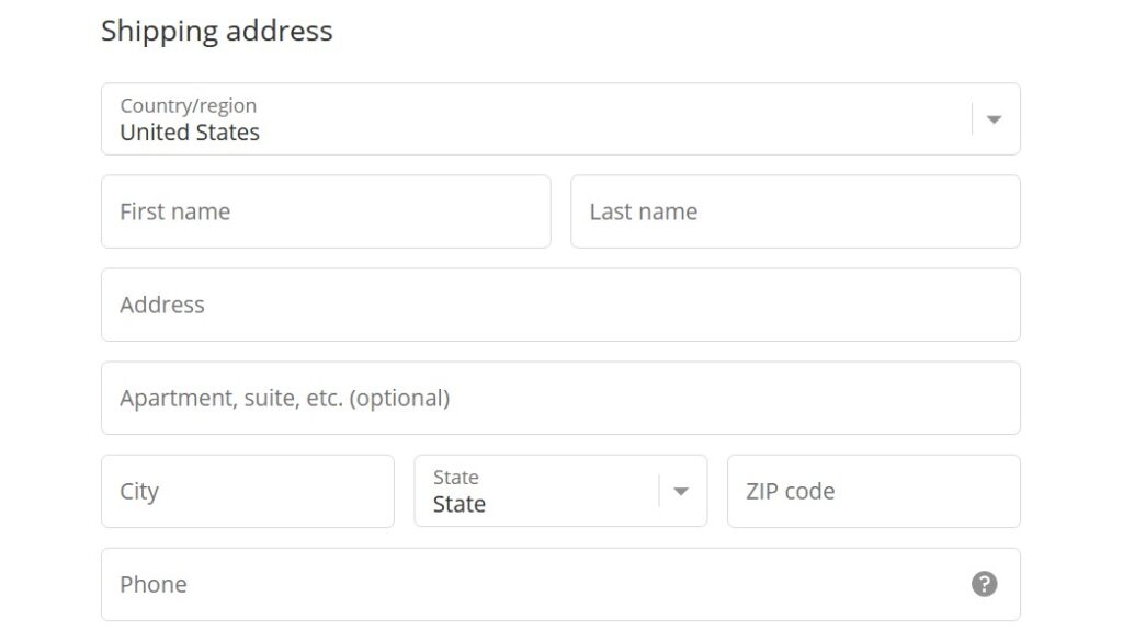
8. Use one column
Present form fields in a single-column layout for easier scanning and completion.
9. Minimize distractions:
Remove unnecessary elements from the form page to keep the focus on the form. Use a simple background and let users focus on the form.
10. Exclude the phone number field:
Avoid asking for phone numbers unless absolutely necessary for the conversion process. Phone numbers are sensitive data that users are reluctant to provide on websites.
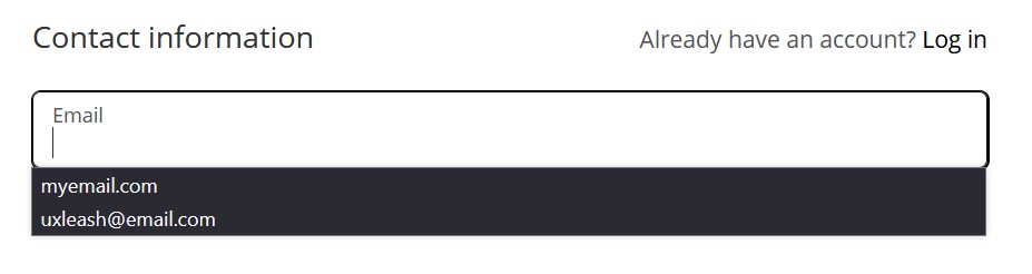
11. Use auto-fill browser:
Leverage the browser’s auto-fill capabilities to automatically populate form fields with user information, making the form-filling process quicker and more convenient.
12. Provide context-sensitive help:
Offer additional information or guidance for fields that may be hard to find or understand, helping users provide the correct information.
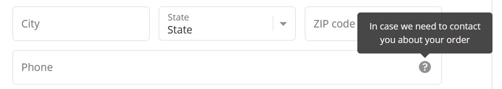
13. Explain the reason for asking for sensible data:
Provide clear explanations or tooltips to justify why certain information is being requested, building trust and reducing user hesitation. For example for fields requesting sensitive information such as phone numbers or company emails.
14. Allow tab navigation:
Allow users to navigate through form fields using the “Tab” key, making it easier for users who prefer keyboard navigation.
15. Position labels above input fields:
Place labels above the corresponding input fields for better visibility. Eye-tracking research has shown that placing the label above the input field is best for usability according to UXmatters.

16. Combine first name and last name:
Instead of separate fields, use a single field labeled “Name” that captures both first and last names. Users tend to think of their name as a single entity according to research by Baymard Insitute.

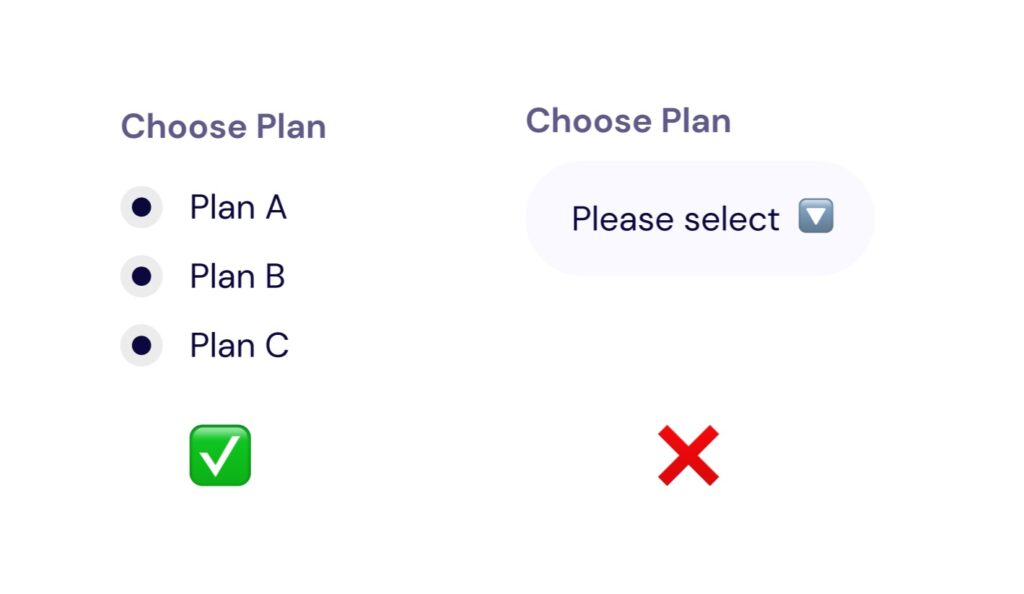
17. Use radio buttons instead of drop-down lists:
When providing multiple choices, use radio buttons instead of drop-down lists for better visibility and ease of selection.
18. Group fields logically:
Group related fields together to create a clear visual hierarchy and improve user comprehension. Place fields that require similar information or serve a common purpose in close proximity to enhance usability (Gestalt Law Of Proximity).
19. Use descriptive, action-based words on buttons:
Use clear and specific labels on buttons to indicate the action they perform. For example, use “Submit,” “Next,” “Cancel,” or “Save” to clearly communicate the intended action to the user.

20. Avoid the use of CAPTCHA:
Minimize the use of CAPTCHA as it can create friction and inconvenience for users. CAPTCHA challenges can be complex to avoid bots, they can cause frustration and increase users’ workload. Use it only when necessary for security or spam prevention purposes.
21. Disable the “Next” or “Submit” button until validation is passed:
Prevent users from progressing to the next step or submitting the form until all required fields are filled correctly and validation criteria are met. This ensures that users do not encounter errors or submit incomplete or incorrect information.